A "Once in a Blue Moon" Website
September/28/2007 Buzz Marketing
I see a lot of websites: the good . . . the bad . . . and (of course) the very ugly. The good ones often distinguish themselves by being slick, clever, and/or engaging. But only occasionally do I come across a website that puts together a series of appealing elements so skillfully that the visitor is compelled to linger and learn, and ultimately to decide that "This is the studio for me."
BlueMoon Studios is located in Mt. Laurel, a planned community in Birmingham, Alabama. The website was created by photographer Butch Oglesby, whose journey to owning a studio in such a charming locale is worth reading about. You can do so by clicking on the About Us tab, where you'll meet Butch and his wife, Joy, and learn about their life, their approach to photographing weddings (a major product line), and read some FAQs that are designed to give prospective clients confidence in the studio's integrity. You'll learn that the Oblesbys' journey included many twists and turns, but all the while, Butch's life-long passion for photography never dimmed. It is a passion that illuminates the site and its accompanying blog, and it makes the business and the people behind it come alive.
In my opinion, an effective website needs to accomplish these things:
- Give the business a "personality." Consumers today want to deal with businesses that are a "good fit" for their specific tastes. And they don't want to do business with just the run-of-the-mill studio. A business with personality stands out.
- Allow visitors to feel as if they know the owner(s) and/or staff. When this happens, your prospects are less apprehensive about the possibility of dealing with the unknown.
- Educate prospective clients about important aspects of your business. Doing so saves you time when you deal with prospects on the phone or in person, and it serves to filter out those who are not a good fit with your business.
- Encourage prospects to pick up the phone to learn more or to book an appointment. If this DOESN'T happen with qualified clients, then your website is nothing more than a distraction.
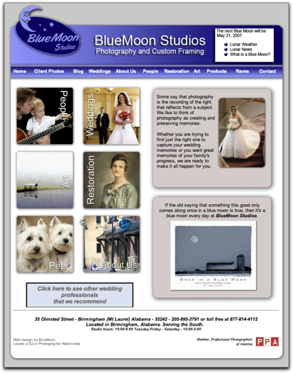
It is not over-designed. You are not hit with exploding images and firecrackers. The design simplicity supports your ability to focus on one thing at a time, and consequently you stay moving through the site.
The navigation is simple! It's easy to find your way from here to there, and you don't get stuck in a corner or lose you train of thought. On any page, you can get back to where you started or move forward to where you want to go. You are provided with both visuals (in the navigation buttons) and good order (in the navigation bar). Absolutely no confusion here.
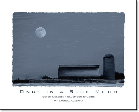
I LOVE the details! The home page gives you a reason for the name "Blue Moon" and sets the bar for prospective clients' expectations when it says: "If the old saying that something this good only comes along once in a blue moon is true, then it's a blue moon every day at BlueMoon Studio. And check out the lunar references on the masthead. Furthermore, instead of the usual "Send" button on the Contact page, there is a "Send to the Moon" button. How clever! The message I'm getting is that these people are both creative and caring about what they do.
The site is strong on education. Education begins on the home page in the upper right corner, where the business mission is spelled out in an eye-catching and easy-to-understand way. The entire tone of the website is educational. Yes, there is advertising copy, but its tone is very low-key. No hard-sell. You are taken gently by the hand and told what you need to know to make an intelligent decision about the photography.
The site sends a strong message about professionalism. This impression begins on the home page, where visitors see a button (lower left) that says: "Click here to see other wedding professionals that we recommend." Very generous. And the prominently displayed PPA logo also is a nod to professionalism. Wedding prospects learn so much when they click on the Wedding page. My favorite feature is the wonderfully designed section that begins when you click on the link that says: "Not convinced? Check the 7 Reasons we are right for you." Take a moment to enjoy each of the 7 pages that support the "7 Reasons." What a wonderful way to gain the confidence of a prospective bride and groom. Professional all the way.
You know whose site you are visiting. Every page has a header with the studio name and a footer that contains complete studio information. Do you know how many websites lack this common-sense approach? I see some really "sexy" websites that never tell anyone what city they are in. Sometimes there's a reason for this, but most of the time it's a simple matter of overlooking the obvious. Next time you browse through a retail-sales catalog, notice that the toll-free ordering phone number is always listed on the bottom of each page. There's a REASON for this!
Visitors learn that this business has earned a high satisfaction rating from their clients. You see this both on the Raves page and in the Galleries on the Client Photos page. The site provides a strong statement about the consistent quality of day-to-day client work.
I could go on and on . . . I love the Products page, Butch's blog, and the simple, yet elegant way each gallery is revealed . . . and the fact that you have multiple options for viewing the studio's images, including nicely expanded sizes. Most of all I love looking at Butch's Art gallery section. What great images, and so nice that they can be purchased! I've posted Butch's signature image below. It's my favorite.
So enough of listening to me. Take some time to treat yourself to a wonderful website experience. Enjoy!